


Problem, Solution, Impact
Problem: Despite how helpful drawchange is to their community, users are having a hard time donating on the current drawchange website. This is because of the confusing choices the website presents, which is causing an adverse effect to the amount of donations the program gets.
Solution: To redesign a product that will improve the process and time it takes to successfully allow the user to donate.
Impact: Our team reduced donation form search time by 14 seconds, from 17 seconds on the original site to 3 seconds on the redesign.
Research
Our heuristic evaluation of the current drawchange website revealed cluttered navigation, hindering access to essential information. Recommendations included improving visual design, enhancing calls-to-action, and presenting success stories effectively. These insights provide valuable guidance for enhancing usability and engaging users on the website.
To the right is a short video overview of the current drawchange website.
Competitor Analysis
Our comprehensive competitor analysis identified market gaps, emerging trends, and customer preferences, providing us with a competitive edge. This analysis plays a vital role in our strategic planning for long-term success in empowering disadvantaged children through art at drawchange.
Below are some of the strengths and weaknesses of some of drawchange’s direct competitors.

To begin our persona creation we had to begin with our interviews with interviewees that aligned with our proto-persona we created. We conducted five 1:1 interviews via Zoom and an online survey. Interviewees expressed a sense of responsibility towards their community when donating or volunteering with non-profits. The survey revealed that 80% of respondents prefer contributing through donations or volunteering. We utilized our key findings and created our user persona.
Persona
We created Savannah Denton, our user persona. Savannah was similar to our proto persona but has all the grouped qualities from our user interviews and survey. Savannah wants to make an impact but occasional needs a reminder for opportunities to donate or volunteer to her favorite non-profits.. She believes children are the future and feels a responsibility to help children from underserved communities. She has a hard time doing this because of the confusing donation areas on the current non profit websites she uses now.
.png)
User Insight & Problem Statement
Our user insight statement for the app aimed to address Savannah's need for a simple way to volunteer and donate to children-focused non-profits. Through interviews and a survey, we discovered that people desire to be part of a solution but face constraints in terms of time and finances. Complicated volunteering sign-up forms and lack of information on donation usage were additional hurdles.
The problem statement initially focused on the limited time available to users for successful donations. However, after iterations, we refined it to reflect the challenge faced by users in locating the donation form on Draw Change's website and feeling overwhelmed by the choices presented. This confusion adversely affected the donation volume.
The revised problem statement for Draw Change's app became: "Draw Change, a program offering self-empowering art classes to children experiencing homelessness and extreme poverty, faces user difficulty in finding the donation form on the website and navigating the available choices. This issue negatively impacts the program's donation flow. How might we streamline the donation process and reduce the time required for users to contribute successfully?"
Definition & Ideation
After gathering research and defining the problem, we brainstormed user-centric layout and features for our navigation bar and home page. Our UX hypothesis stated that an efficient and user-friendly volunteer sign-up and donation process would attract more volunteers and donors. This guided us as we crafted our user scenario.
User Scenario
We created a user scenario chart featuring Savannah. We utilized this graph to gain a better understanding of how our users interact with the drawchange site. This assisted us in identifying opportunities to enhance Savannah’s experience and make informed design decisions.


Card Sorting
Our group utilized a card sorting software by putting in our main topics and our secondary topics for navigation. We sent a link to a few different people and let them sort the cards in their natural way of ordering them. From there we used the feedback to create our sitemap. Sitemap shown below.
Sitemap

Wireframing
Sketches and Lo-Fi Wireframes
After finalizing the user flow, we transitioned to wireframe sketches where we outlined the key features and functionality of our app.We each drew sketches of each wireframe page we would need from our user flow. Below are the sketches I made for the wireframes.
We combined sketches into an ideal wireframe flow and created digital wireframes using Figma. Through iterations, we developed a final clickable mid-fidelity prototype. We split the sketches into a couple of us working on the mobile and the others working on the desktop. From there we went into our lo-fi wireframing, splitting the weight equally between us four again.

Design Options (A/B Testing)
We were undecided within our group on whether the donation area should be a full page or a pop-up form. To gather opinions, we designed both options in low fidelity and shared them in our cohort Slack channel. Through a voting process using separate emojis, 12 people voted in favor of a full donation page. Voters provided valuable feedback, stating that a pop-up form feels less trustworthy. Based on this feedback, we made the decision to create a full donation page. Here are the two options we considered.

Moodboard and Style Guide
We created a mood board and UI style guide for our nonprofit redesign project. The mood board set the visual direction and aligned our team, while the UI style guide ensured consistency in colors, typography, and design elements. These tools guided our design decisions and established a strong visual identity, resulting in a cohesive and engaging user experience.
Full style guide here

Initial Hi-Fi Wireframes & Usability Tests
From there we took the next steps and continued working on this case study. We received more feedback to create a high fidelity prototype of our low-fidelity design. We added color, animations, carousels and more.
We completed 6 usability tests between the desktop and mobile versions of our redesign. Some of our key takeaways included that the home page felt empty, the font on the desktop homepage felt hard to read, and that the copy on both needed to be re-worded in a lot of places. To the right is our affinity diagram we created from our usability test notes.


High Fidelity Wireframes User Flow
Our group meticulously crafted high fidelity prototypes for both desktop and mobile versions of the drawchange nonprofit website. The desktop prototype boasts a sleek and user-friendly interface, allowing visitors to effortlessly navigate through the various sections and explore the organization's mission, programs, and success stories. With vibrant colors and engaging visuals, the prototype captures the essence of drawchange's artistic approach and inspires users to get involved.
Desktop
.png)
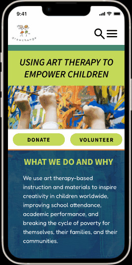
The mobile prototype is optimized for on-the-go users, ensuring seamless accessibility and a delightful user experience across different screen sizes. It features a responsive design that adapts beautifully to mobile devices, retaining the website's core elements while making efficient use of limited screen space. The intuitive navigation and clear call-to-action buttons enable visitors to easily find information about drawchange's events, volunteer opportunities, and more importantly for our user, donation options.
Mobile

Both prototypes demonstrate meticulous attention to detail, incorporating consistent branding elements and a harmonious blend of typography and imagery. The interactive elements, such as dropdown menus and carousels, enhance user engagement and provide a preview of the website's functionality. These prototypes serve as a strong foundation for the drawchange nonprofit website, empowering the organization to effectively communicate its message and inspire positive change.
.png)
Reflection
Leading a group was a great way for me to learn that feedback, good and bad, is always good for the project. The production of this project involved constant collaboration in which every phase of development was met with challenges like scheduling conflicts, computer spazzing, and constant disagreements that helped develop the best design of this website.
Our experience working in a group taught us that collaboration can be challenging, even with the same end goal. Working together showed us that not all design decisions are black and white, and we take the time to hear everyone's perspective before making a decision to create the best design for our user. It's was an honor to work with such a diligent and patient team.
I am proud of the work we accomplished on this project but feel that there are still things I would have liked to work on if we were allotted more time. This next steps include:
-
Implement the Volunteer Portal and Application pages.
-
Conduct a usability test with the Non-Profit to receive feedback for further iteration.
-
Reach out to stakeholders for more information on their volunteer programs, including quantitative data on donations and volunteering.