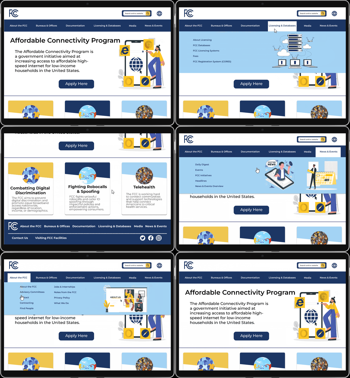


Problem, Solution, Impact
Problem: Users of the Federal Communications Commission Website are overwhelmed by the amount of text on each page and difficult navigation.
Solution: Aiming to enhance user experience and streamline access to critical information, the FCC website will undergo a redesign focused on intuitive navigation, optimized layout, and user-centered design principles.
Impact: I was able to reduce search time for the Disability Rights Office page by 12 seconds: 32 seconds on the original FCC site, 20 seconds on the redesign.
Research
I started this process by trying to understand who would be going to the Federal Communications Commission’s website. From there I created my proto-persona, a young woman named Lyssa Kane. She is a Human Resources Manager who is trying to understand the regulations for disability related matters for her company.
%201.png)
Heuristic Evaluation
Upon conducting a heuristic evaluation of both the desktop and mobile versions of the FCC website, I observed several significant issues with the current site. Primarily, there was an excessive amount of textual content, overwhelming users. Additionally, the absence of a help button hindered users who might have become lost or confused while navigating the site. Lastly, the placement of elements, including images and text, seemed haphazard and lacked a deliberate and organized arrangement on the page.
.png)
Color Analysis
Once finishing with the heuristic evaluation, I went through and wanted to check the accessibility of the colors, and fonts of this site. I felt the colors were a good fit for the site and decided to keep them for my redesign.

Usability Tests on Current Site
I conducted 5 usability tests of the current site to see what Lyssa, my proto persona, would go through if I gave her four tasks. All users completed their tasks, but for some tasks it took a while for the user to be able to complete the task.
I combined my notes from these tests into a diagram and created a affinity diagram of sorts. I added stickers to notes that seemed to have the same pain point topic. I also added a Thumbs Down sticker for if a user was not able to complete a task recited to them. I created an in depth review of my notes here: Usability Testing Notes
.png)

I created an empathy map from my findings to gain a deeper understanding of users' needs, goals, and emotions. From there I took what was important to our user Lyssa and created a 2x2 competitive matrix to show the range of importance to the user and FCC. This shows us what specific adjustments to the site have priority over the others.
Annotations

Using my findings above, I went through and annotated the desktop website to help myself visual things that needed to be changed.
Annotating this government website served several important purposes:
-
Identify pain points: Annotations highlight usability issues and user frustrations for focused improvement.
-
Document observations: Annotations serve as a record of findings and insights for reference throughout the redesign process.
-
Facilitate collaboration: Annotations enable visual communication and feedback among team members and stakeholders.
-
Support data-driven decisions: Annotated findings provide empirical evidence to guide design choices and enhance the user experience.
-
Track progress: Annotations help monitor changes made to the website, ensuring issues are addressed and objectives are met.
Definition & Ideation
Once we gathered all of our research and defined the problem, we were able to brainstorm what features would most benefit our users, and then translate that experience emotionally through our user journey map and storyboard.
We brainstormed potential features for our recycling app, dot voted on the best ideas, and narrowed down to a rewards system, visual tracker, and locator.
Moodboard
We created a storyboard featuring Leslie, who uses our app to recycle an old mattress, track her impact, and earn points for a plant. Our journey map shows her emotional ups and downs. With features and journey defined, we began building our prototype.
.png)

Feature Prioritization Matrix
We brainstormed potential features for our recycling app, dot voted on the best ideas, and narrowed down to a rewards system, visual tracker, and locator.
UI Style Guide
.png)
The UI Style guide I created successfully captures a playful and lively tone that I wanted for the FCC website that deals with serious topics. By infusing elements of fun colors and imagery into the design, the style guide ensures a delightful user experience while maintaining the necessary seriousness and professionalism required for the content.
Card Sorting & Sitemap
I utilized card sorting to improve the navigation of the FCC website. With a volunteer, I instructed a volunteer to follow these instructions:
-
Examine the topics on the sticky notes.
-
Group them based on patterns in the spaces to the right, allowing category names to emerge naturally.
-
Create an "Other" category for uncertain or unmatched topics, explaining the reason (e.g., lack of understanding or unfitting categories).
From there I was able to take the results of the card sorting (to the right) and make my improved sitemap shown below.

.png)
Wireframing & Prototyping
After finalizing the sitemap, I transitioned to wireframing the navigation and home page of the FCC website. These simplified visuals allowed for me to do five second usability tests on the home page as well.
5 Second Usability Tests
The five-second usability test was a quick and effective way for me to evaluate the initial impression of my design of the home page within a very short timeframe. I aimed to assess whether users could quickly grasp the purpose, content, and key elements of my design and if they found it pleasing. Five volunteers participated in the five-second usability test, which was conducted using a dedicated testing platform.
.png)

I then took the negative feedback from my usability tests which was mainly about the footer and adjusted the design of my desktop homepage.


Mid-Fi Wireframes
From there, I created the rest of my navigation pages and created a low to mid fidelity prototypes for the desktop and mobile versions of this site.
.png)
Desktop
Mobile
.png)
Hi-Fi Wireframes & Prototyping
By combining my style guide with the low-fidelity wireframes, I were able to create high-fidelity prototypes that showcase the visual aesthetic and design elements while keeping true to the feedback from my beginning usability tests of the original site. This integration ensures that the prototype reflects the desired look and feel of the final product, providing a realistic representation of the user experience.
To the right is my high fidelity desktop wireframes and below are my high fidelity mobile wireframes.
_edited.jpg)
Desktop
Mobile

Usability Testing
I utilized the usability test plan dashboard to the right to come up with my usability testing information. From there I conducted six usability tests: three on the Mobile and three on the Web based site each. I combined the feedback from these tests into a slidedeck here and prepared my final iterations of my prototypes below.
.png)
Reflection
Lessons Learned
-
Redesigning an existing website is challenging.
-
High-fidelity designs allow for detailed exploration.
-
Heuristic evaluation and annotations can be difficult.
-
Defining the mood for a government website is challenging.
-
Prioritizing a clean, user-friendly, and enjoyable webpage is crucial.
In summary, redesigning a government website was tough, but rewarding. High-fidelity designs helped me dive deeper. The heuristic evaluation and annotations were challenging but became more satisfying to produce as I practiced more and more. Creating a mood and developing a style for a government website was difficult. However, I'm proud of the clean, professional and fun webpage I created.
To enhance the user experience, I aim to focus on iterative improvements for the navigation and home page UI elements. Conducting additional usability tests, including 5-second usability tests, will enable me to make informed iterations based on user feedback. Furthermore, I plan to expand the website by creating additional pages that delve into the various topics featured on the home page, providing users with more content to explore beyond just the home page and navigation.

